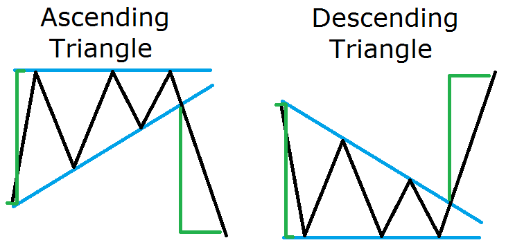
 The ascending triangle has tops, which lay on the same horizontal line and has higher swing bottoms. The descending triangle has bottoms, which lay on the same horizontal line and lower swing tops.
Although many people consider these chart patterns as neutral, their chance to reverse the trend is a bit higher. Thus, I put them with the trend reversal chart patterns. This is how the ascending and the descending triangles look:
As you see, ascending and descending triangles are very similar to the rising and falling wedges. The difference is that rising wedges have higher tops and falling wedges have lower bottoms, while ascending triangles have horizontal tops and descending triangles have horizontal bottoms.
When an ascending/descending triangle is confirmed, we expect a reversal price movement equal to the size of the formation.
This is shown with the green lines on the image above. The stop loss should be placed right beyond the horizontal level of the triangle.
Neutral Chart Pattern – Symmetrical Triangle
Symmetrical triangles have two sides, which are approximately the same size. Since the two sides of the triangle are usually the same, this creates a technical force equivalency, which creates the neutral character of the formation. The image below shows how a symmetrical triangle appears:
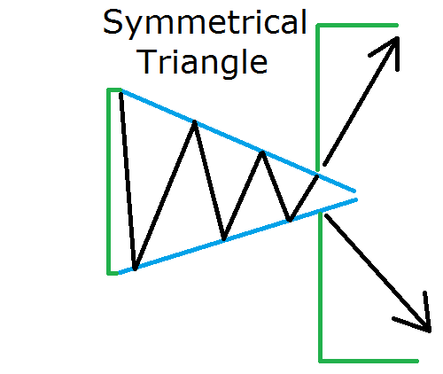
When a symmetrical triangle occurs on the chart, we expect the price to move in an amount equal to the size of the formation. However, the direction of the breakout is typically unknown due to the equivalency of the two sides of the triangle. Thus, price action traders tend to wait for the breakout in order to confirm the potential trade direction of the formation. If you trade a symmetrical triangle, you should place a stop loss right beyond the opposite end of the breakout side.
Trading Chart Patterns
Now that I introduced you to the most important patterns for chart reading it is now time to show you an example of the chart patterns in action. Have a look at the image below:
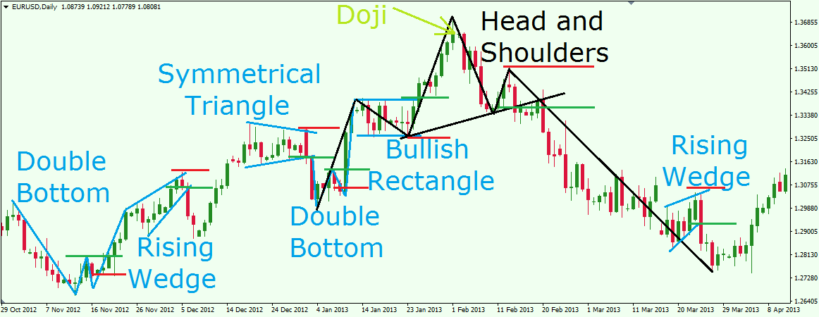
This is the daily chart of EUR/USD for Oct 29, 2012 – Apr 12, 2013. Our chart analysis shows seven successful chart patterns. The green lines show where we could open our positions. The red lines show where stop losses should be placed.
First, we start with a double bottom formation. The green line is the signal line of the figure and the moment where we would go long. The red line is the stop loss, which is approximately in the middle of the formation. The EUR/USD price increases to 187 pips in 5 days.
The price increase turns into a rising wedge afterwards. Since the wedge comes after a price increase, it has a reversal character. The lower level of the wedge gets broken in bearish direction and would be a potential short on the EUR/USD. The could be closed after two days when the price reached the size of the formation. The profit gain would have been 190 pips.
Then the price starts a new increase which leads us to a symmetrical triangle. Look how the sides are approximately the same size and under the same angle. Since the symmetrical triangle has neutral character, we wait for a breakout. And here it is in bearish direction. We could have shorted the EUR/USD and placed the stop loss right above the figure. In the same day the price completes the size of the formation – 137 pips that same day.
The decrease after the symmetrical triangle leads us to the first bottom of a double bottom formation. When we spot the second bottom, we would put the signal line right above the top between the two bottoms. The price breaks the signal line and a long trade is confirmed. We would place the stop loss around the middle of the figure. In this particular case, one could have stayed in the market for twice the size of the formation!
Soon afterwards, price starts consolidating. Notice how the consolidation resembles a rectangle? Indeed! This is a bullish rectangle! The price breaks the upper level of the rectangle and a buy setup occurs in this EUR/USD Forex pair. We could manage to stay with this long position more than the potential of the rectangle, because we get no bearish behavior after the bullish potential is fulfilled. The price starts hesitating afterwards and we see some bearish attitude on a lower time frame chart (H4). Furthermore, on our daily chart the price closes a Doji candle which has a potential reversal character.
Suddenly, the price finally starts to drop. Do you see something? See the black lines on the image above. The last double bottom followed by the bullish rectangle creates a shoulder and a head. The following decrease creates a second shoulder afterwards. This is a nice head and shoulders formation. In order to confirm the setup, we need price to break and close beyond the neck line of the formation. So, we connect the two bottoms which create the head and we get our neck line. A shorting opportunity in the EUR/USD occurs right after the price breaks the neck line. We could sell the EUR/USD and put a stop loss right above the last shoulder of the figure as shown on the image. We would want to stay with the short position until the price completes the size of the figure.
Then a corrective rising wedge appears. It is up to you if you are going to close the head and shoulders position and then open another short position to trade the rising wedge. The other option is to stay with the head and shoulders short position until the wedge is completed. In both cases you would have generated solid profit from the head and shoulders pattern.
